Visual identity & design system
I've worked with Growify's founder for years, in agency and in business outside it. I drew their first identity in 2023, when the agency was brand new. As they grew, I came back through Hive to refresh it into a system they could build a business on.
- Role
- Designer, then creative partner through Hive
- Year
- 2023–25
- Worked with
- Growify's founders and developers
- Where
- Studio
- What I did
- Logo designVisual identityDesign systemWeb design

The brief
Growify is a strategy and marketing agency working across Leicester, London and Porto. When they started, they had a name and not much else. They needed an identity that said growth without looking like every other marketing agency.
The idea
The name did a lot of the work. The mark is a leaf, a seed and an arrow at the same time: a rounded, natural shape in a fresh green, with an arrow inside it pointing onwards and upwards. Growth in nature, and growth for the clients they take on. An agency that adapts and grows with the people it works for.

The 2023 logo: an icon and a heavy, friendly wordmark.
It came with a mini style guide covering logo use, colour and type, so anyone picking the brand up could use it properly from day one.


Pages from the guidelines: how the icon and wordmark fit together, and the full colour and white-out versions.

The first website
Next came the website, designed in Adobe XD and built in WordPress. With the logo, colour and fonts already set, the site was where the identity grew up: iconography, image treatment and the feel of the components. A brand-new company meant room to experiment.


Growing into it
Two years on, Growify had sharpened its positioning and widened its services. The launch identity was good enough to start with, but not built to grow with, and a new website needed a proper system to build from. Through Hive, now their creative partner, I refreshed it.

The refresh: darker, sharper and more premium, without the gradients most marketing agencies default to.
- 1
Logo marks
A primary wordmark, a stacked version and a compact motif, each built to work from a browser tab to a pitch deck cover.
- 2
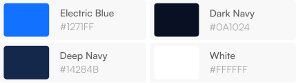
Colour
A darker palette that feels premium, with enough accent to keep it alive. Every colour documented and ready to build with.
- 3
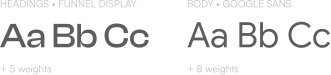
Type
Two typefaces, two jobs: a characterful display face to set the tone and a clean body face to do the heavy lifting.
- 4
Design system
The whole lot documented in Figma, component by component, ready for a Next.js and Sanity build.

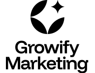
Three versions of the mark: landscape, stacked and the compact motif.
The design system was the reason the brand was rebuilt the way it was. Their developers could pick up a component and build with it, so the new site came together quickly and without the brand drifting at every decision.

The new site, built from the system.
Jack built us a design system that just works. Every component is on-brand, beautifully considered, and a genuine pleasure to build on. It's become the backbone of our entire site.
Rafal Gemza, Founder and CEO, Growify Marketing
Where it is now
Growify is now Hive's strategy partner, and I still look after their brand: collateral, campaign assets and design calls as they move into new services and markets. It's rare to get to design a brand, watch it work, and then get to make it better.


